
Інсталювати Steam
увійти
|
мова
简体中文 (спрощена китайська)
繁體中文 (традиційна китайська)
日本語 (японська)
한국어 (корейська)
ไทย (тайська)
Български (болгарська)
Čeština (чеська)
Dansk (данська)
Deutsch (німецька)
English (англійська)
Español - España (іспанська — Іспанія)
Español - Latinoamérica (іспанська — Латинська Америка)
Ελληνικά (грецька)
Français (французька)
Italiano (італійська)
Bahasa Indonesia (індонезійська)
Magyar (угорська)
Nederlands (нідерландська)
Norsk (норвезька)
Polski (польська)
Português (португальська — Португалія)
Português - Brasil (португальська — Бразилія)
Română (румунська)
Русский (російська)
Suomi (фінська)
Svenska (шведська)
Türkçe (турецька)
Tiếng Việt (в’єтнамська)
Повідомити про проблему з перекладом


http://steamcommunity.com/sharedfiles/filedetails/?id=247181666
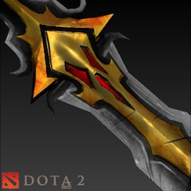
ВАУ ! Хорошая модель !
This item seems a little too shiny.
Try to match the gold color to his armor better (which is more orange).
I think your variation of highlighting/shadow within each segment is a little overdone. I can't tell how much of this is from the extreme specular and how much of it is base color. With Dota2, you can really use smaller range coloring for each segment (no need to put in the bright highlight). This improves readability of the item and will help you match the game's look and feel better.
The red slits are barely visible in-game and are coming across as noise. You need to combine them and/or make them larger - basically rethink that part. You could do one huge slit, a diamond, etc. Look at the in-game screenshots- you wouldn't even know they were there.