

Install Steam
sign in
|
language
简体中文 (Simplified Chinese)
繁體中文 (Traditional Chinese)
日本語 (Japanese)
한국어 (Korean)
ไทย (Thai)
Български (Bulgarian)
Čeština (Czech)
Dansk (Danish)
Deutsch (German)
Español - España (Spanish - Spain)
Español - Latinoamérica (Spanish - Latin America)
Ελληνικά (Greek)
Français (French)
Italiano (Italian)
Bahasa Indonesia (Indonesian)
Magyar (Hungarian)
Nederlands (Dutch)
Norsk (Norwegian)
Polski (Polish)
Português (Portuguese - Portugal)
Português - Brasil (Portuguese - Brazil)
Română (Romanian)
Русский (Russian)
Suomi (Finnish)
Svenska (Swedish)
Türkçe (Turkish)
Tiếng Việt (Vietnamese)
Українська (Ukrainian)
Report a translation problem


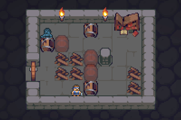
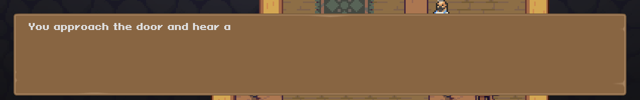 It was difficult to see what button is focused, especially it was confusing on the level complete window. So it is where Olaf himself is going to help us nailing every answer option. Literally. Now you can see Olaf hammering the active button, I found it both cute and useful.
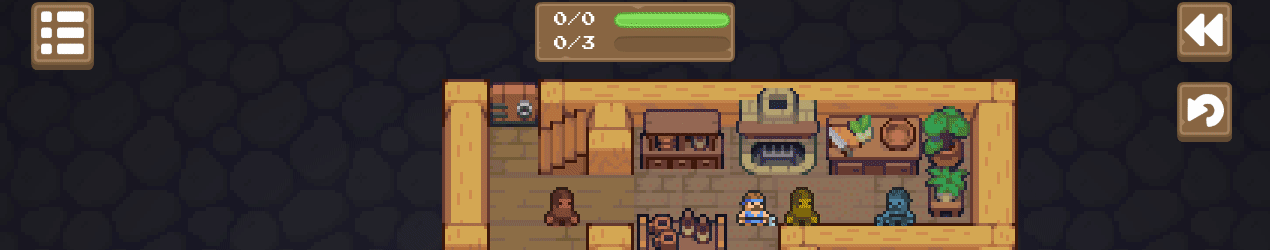 For users with wide screens I added limits on how wide UI can be. Also I fixed level centering, so now levels should not be hiding somewhere. Please, let me know if you think that the dialog box is still too wide.
 Loading
