Garry's Mod

Garry's Mod

338 个评价
Guide to Gmod Art Fundementals
由 Doctor Flounder Box 制作
An introduction to art topics that will boost the quality of your gmod art, guaranteed.
   
奖励
收藏
已收藏
取消收藏
Introduction

The end result of implementing the fundementals in this guide, original courtesy of "Ninja Nub"

Alright nerds, there are plenty of guides out there on how to make gmod screenshots and SFM Posters. What this guide is going to do is give you a crash course in Art101 on topics that relate to visually pleasing images in the source engine. This guide is going to be written with gmod in mind, but the concepts will apply to SFM users as well. I personally use both, so I will make sure that this guide is applicable for both of these tools. There are also no addons used aside from models downloaded from the workshop or other sources. This guide does assume though that you are familiar with your toolset. At the least, you should know how to use the camera tool and be vaguely familiar with gmod's tools. In this guide, we will cover...
  • Topic 1- Composition
  • Topic 2- Color
  • Topic 3- Lighting
  • Topic 4- Posing
  • Critical Analysis
  • Conclusion
I've been doing gmod/sfm screenshots for about 5 years now (Here's my DA if you want to see what I've done recently http://flounderbox.deviantart.com/ ). I'm no means close to the best (there are examples in here that blow anything I've done way out of the water), but I feel like taking the time to share what I have learned with you all in hopes of seeing the community put out the quality content I know that it is capable of.
Topic 1- Composition
Composition is a complex topic when studying art. Composition is generally referred to as the arrangement of objects in a piece that guide and pace the movement of the viewers eyes. In the case of working with the source engine, this can refer to the placement of objects like ragdolls and props. Some of the common elements of composition that you'll want to be focusing are...

Unity: Objects belong together. Terrible pony OC's posed with soldiers looks ridiculous and awkward. Make your objects consistent with each other. Same goes for lighting.

The ragdoll on the far left is way out of place. The pale skin, and extra dirty clothes really stick out amongst the cleaner and more fair skinned ragdolls on the right. Image provided by "T553412"

Balance: Refers to the symmetry of the entire scene. A symmetrical image can help a scene feel comfortable, formal and familiar while an asymmetrical image may promote feelings of discomfort or unease.

This image by Joazzz demonstrates how balance can be used to add scale and weight to a subject. The imaginary lines represent lines the eye can follow to seperate the image into different scales, aiding the perspective.

Movement: Movement doesn't refer to objects that move in the scene, but the movement of the eye over the entirety of the image. Having an overabundance of details without proper focus can result in the viewer having a difficult time reading the image.

Rhythm: Rhythm can refer to the pacing of the eye's movement over an image. Lots of curved and flowing organic shapes can make the viewing smooth and pleasant. Sharp edges and points like on squares can result in a much slower and uncomfortable rhythm.

Example of rhythm, original by "Ninja Nub"

Focus: Ideally, there will be a point in the image where the eye will want to stay and rest. Usually, the focus is on the main subjects.

Subject is in focus while the majority of the background is blurred, original by "[LOA] SonofBrim"

Contrast: The effect of opposites on the scene. Most commonly, contrast refers to the strength of the difference between light and dark. Color and light are usually the most common tools associated with contrast.

Dark shadows and illuminated figures demonstrates contrasts, original by "B E A R"

Pattern: Repetition of elements including the basic shapes that makes up an object.

Proportion: The size of objects relative to the rest of the scene. Camera tricks can make a small object a big part of the scene, or large objects a small part of a bigger scene.

Implementing those elements is the first step to creating something really impressive. They're the same in any visual field including photography and painting. The difference between us and the big guys is that the source engine is our paintbrush (and also that we use a wide collage of work ported from other video games).


Composition Tips and Tricks

"The rule of thirds" http://en.wikipedia.org/wiki/Rule_of_thirds
The rule of thirds is a guideline that suggest you to divide your image into an even 3x3 square where the horizon lies on either of the two horizontal lines and your focus lies on the intersecting points of the grid. The rule of thirds is an excellent starting point for beginners to experiment with composition. It's not a "cure all" for ♥♥♥♥♥♥ images, but it's a great tool for understanding those elements we talked about earlier.

Rule of thirds demonstrated by "[LOA] SonofBrim"

Zoom in with the camera!!!
I cannot stress this enough. The easiest way to control your focus, movement and balance is to zoom in with the camera. Zooming out was a thing that film makers in the 90's who thought they were being edgy and new wave tried to do. It looked like garbage and now nobody does it, and you shouldn't either.


Zoomed Out


Zoomed In
Topic 2- Color
Color is a difficult subject to discuss, since in our context it is a rather abstract subject. The difficulty comes from implementing it correctly. In the context of the source engine, your best tools for implementing color are lights, lamps, fog, and the colors of your props. I'll do my best to discuss the basics of color theory, but you're much better off reading about it here.
http://www.colormatters.com/color-and-design/basic-color-theory
The following is a color wheel. It demonstrates the relationship of the three primary colors. Red, yellow and blue. Mixing those colors get's you a variety of other colors known as the "secondary colors", and mixing those gives you the "tertiary colors".

And that is how colors are born. Looking at this wheel, we can see a couple of relationships between colors.


Colors that are next to each other on the wheel are known as analogous colors. These colors will usually complement each other well, and can be easily be implemented with three separate light sources (Which will be discussed further in the next section).

Colors opposite to each other on the wheel are referred to as complimentary.

This relationship will usually provide the most drastic contrast. In some cases this can be useful, but it's not nearly as effective when it comes to lighting in source.
Experiment with analogous and complimentary colors. Some examples may look good, some may not. Half the fun of working in an inexpensive environment like Source is experimenting!
Topic 3- Lighting
As said earlier, the lamp and light tools are the most valuable tools in source for creating color. However, when creating your lights make sure you understand your light sources. A realistic image in particular should have easily recognizable light sources, and as a result have reasonable colors. A more stylized image can most definitely take some liberties, but make sure you understand the colors you plan on working with before sharing an image like that.


Example of abstract lighting "Sharker"


Example of more realistic lighting "Luxuria"

Everything we covered in the color section applies to lighting as well. However, where you place the lights is a completely different question. Our plight most relates to photographers, so it's natural to see how they do it.

One of the most common setups you will see is three point lighting. This method involves using three different lights.


Key Light: Illuminates the majority of the figure and establishes the primary color of the scene.

Fill Light: A light set up on the side to fill in the shadows created by the key light.

Back Light: Creates a back layer of light that helps distinguish the subject from the background.

The standard three point lighting setup will be the best place for most people to start off. From there, you can start to play around and experiment with other lighting setups of your own. If you need ideas, look up other photographers lighting setups.

Examples provided by "Luxuria"


Ingame demonstration of 3 point lighting


Full lighting setup.
Topic 4- Posing
Some scenes may not include a character, but this section covers those that do.
Animation is the art of creating the illusion of motion using a series of still images. It can be helpful to think of a ragdoll pose as a still of a single frame of animation. Ideally, you would have all of the time in the world to read Richard Williams "The Animators Survival Kit", perhaps one of the best books about animation ever written. Most of us either don't have the time, or are incredibly lazy, or some combination of the two.

A companion to the book was released on the Apple store. It can be found here if you would like to learn more.
https://itunes.apple.com/us/app/the-animators-survival-kit/id627438690?mt=8&ign-mpt=uo%3D4

Frank Thomas and Ollie Jonston's classic "The Illusion of Life" illustrates the 12 core principles of animation, and by relation, posing. I won't go into detail about each of them, but some of them should speak for themselves. It's worth doing the extra research on your own here, since animation and posing is an incredibly broad topic to cover.
  • Squash and stretch
  • Anticipation
  • Staging
  • Pose to Pose
  • Follow Through and Overlapping Action
  • Slow In and Slow Out
  • Arc
  • Secondary Action
  • Timing
  • Exaggeration
  • Solid Drawing
  • Appeal


A good way to start posing is to look at reference images of real life subjects in various poses and try to emulate it with your ragdoll. Deviant Art is a good place to find reference and stock images. Here's something to get you started.
http://www.deviantart.com/art/Male-Gun-Pack-2-Pose-Reference-341188582
I wouldn't try to emulate the face though.

Posing Tips and Tricks

Points of contact
Sometimes, source's collisions don't let your ragdoll sit all the way on the ground resulting in it slightly hovering above the ground. Don't settle for this. Tools like nocollide world and even the regular nocollide will easily let you place your ragdolls feet completely on the floor. Same goes for posing ragdolls holding or interacting with props. Never settle for weird hovering.

Physgun
The advantage of the physgun in gmod is that the physics of the ragdoll will simulate damping and other reactions to gravity. Take advantage of this in your posing. For SFM users, the closest equivalent is rigging your model to an IK Rig and then posing from there.
Critical Analysis
Now we are going to take an example and apply what we have learned to understand what the image does right, and what it does wrong.

This one was done by me a few weeks ago. Let's start with the composition.


If we split the image into the grid used for the rule of thirds, we can see that the main subject lies on one of two points. This makes the upper half of the image much weaker than the rest of the image. This could have been remedied with some more cropping in photoshop of whatever editor of choice you have. The top of the rock on the right just about matches the lower horizontal line, so we at least have some balance in the scene, even if it's not consistent.


The square blocks of color are samples of colors used in the scene. Comparing the more dominant light blue to the light earthy tone of the rocks, we see that they are tertiary colors. Perhaps the rocks are a bit to pale though and end up blending more into the background then if they were a much darker tone.

I don't have an image to compliment the lighting, but from the vanilla image we see quite a bit of contrast in the lights. Lots of dark spaces where no light is present. On the figure, it makes sense because of the position of the light source, but not so much on the rocks.


The pose is nothing to write home to mom about either. Though the figure is not in motion, his legs don't seem to reflect the travels of a weary soldier. They should be far more relaxed and perhaps spread out a bit further. Same goes for the arms, particularly the right arm holding the gun. The weight of the gun should be weighing down the arm resulting in little to no curve of the elbow.

Summary of Analysis
From our analysis, we know next time that the creator should include more vibrant colors, have consistent line rhythm, make the subjects pose more dynamic, and understand his light source in relation to the environment better. Performing an analysis on your own work is just as important as commenting on others works.
Conclusion
We just went through a crash course on the bare bones basics of all of these topics. People dedicate their entire lives to those fields and it would take twice as long to learn everything there is to know about those fields. Most of you reading are probably just hobbyists looking to create something quick and easily. Nothing worth looking at was "easy" to make, so don't blindly follow shortcuts and expect a good result. That being said, don't be afraid to experiment and try new things.

Never be afraid of criticism. If someone says your work is ♥♥♥♥, there's probably a reason why. Find out what it is and improve on it. Comments and criticism are the only way you will improve. Hopefully you learned something here and you'll apply it to your future works.

If you have questions, or just want to share your work, feel free to leave it in the comments, or share your work in the gmod screenshots section of the facepunch forums. We're always willing to give quality criticism (for better or for worse, that's up to you)
http://facepunch.com/forums/198

Also, a huge thanks to everyone who let me share their work with you all and I really hope you check out their stuff.

Much Love
~Doctor Flounder Box


ps: I'll be updating this guide with more images and examples that better explain the concepts in this short guide. I'll also do more in-depth guides if they're requested.

To do list
  • Expand on posing section
  • Add examples for all Topic 1 elements
  • Proofread (whoops)
  • Provide more examples of lighting setups
44 条留言
_OwOzoline 2022 年 1 月 22 日 下午 11:53 
Holy, How was this NOT awarded already?!
bau 2022 年 1 月 11 日 下午 11:27 
im trying to learn how to make a simple fucking artwork not trying to figure out the componements to make a vaccine for every disease
Sudargo 29 Octoling 2021 年 1 月 31 日 上午 10:11 
okay I'll try that
Sprazzy Gazoozle 2020 年 7 月 25 日 上午 10:38 
Hello, and thanks a lot for this guide!
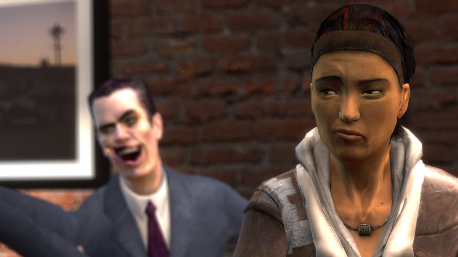
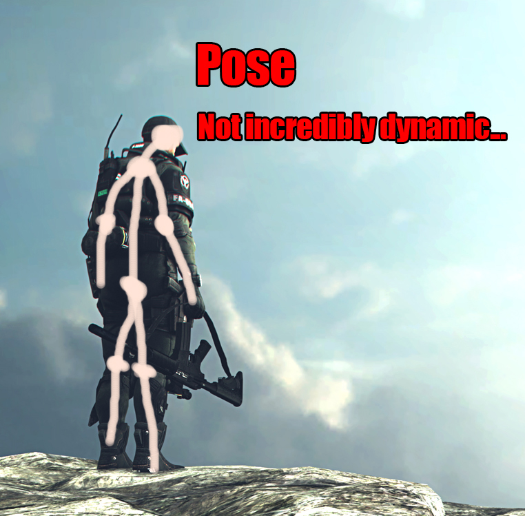
There is one thing that is particularly finicky for me and is hard to get -- fiddling around with props and tiny objects, with the risk of ruining the whole pose. Any way to fix this problem?
Thanks again. c:
:os_niko:
Niko Perish 2020 年 4 月 7 日 上午 8:15 
Too bad life SUCKS and nothing gose right.
Ushankov 2019 年 9 月 23 日 上午 5:45 
i make this artwork and i don't know it's good or not https://steamcommunity.com/sharedfiles/filedetails/?id=1869761123
chopper 2019 年 8 月 21 日 上午 7:30 
https://steamcommunity.com/sharedfiles/filedetails/?id=1841176207 I need some feedback please check it out!
Spitfire1 2019 年 7 月 24 日 上午 10:06 
Pretty late answer but, i would like to know what you think of this artwork and give me any feedback, even criticism is allowed i'm still learning so! :D https://steamcommunity.com/sharedfiles/filedetails/?id=1785498819
Rexy the Fry Cook 2019 年 3 月 8 日 下午 6:32 
Dis is alot
Relaxed Stuntman 2018 年 8 月 7 日 上午 4:22 
Cheers for the guide, mate! I was using the guide for one of my artworks, mainly focusing on composition and lighting and I'm not sure if I got it right.
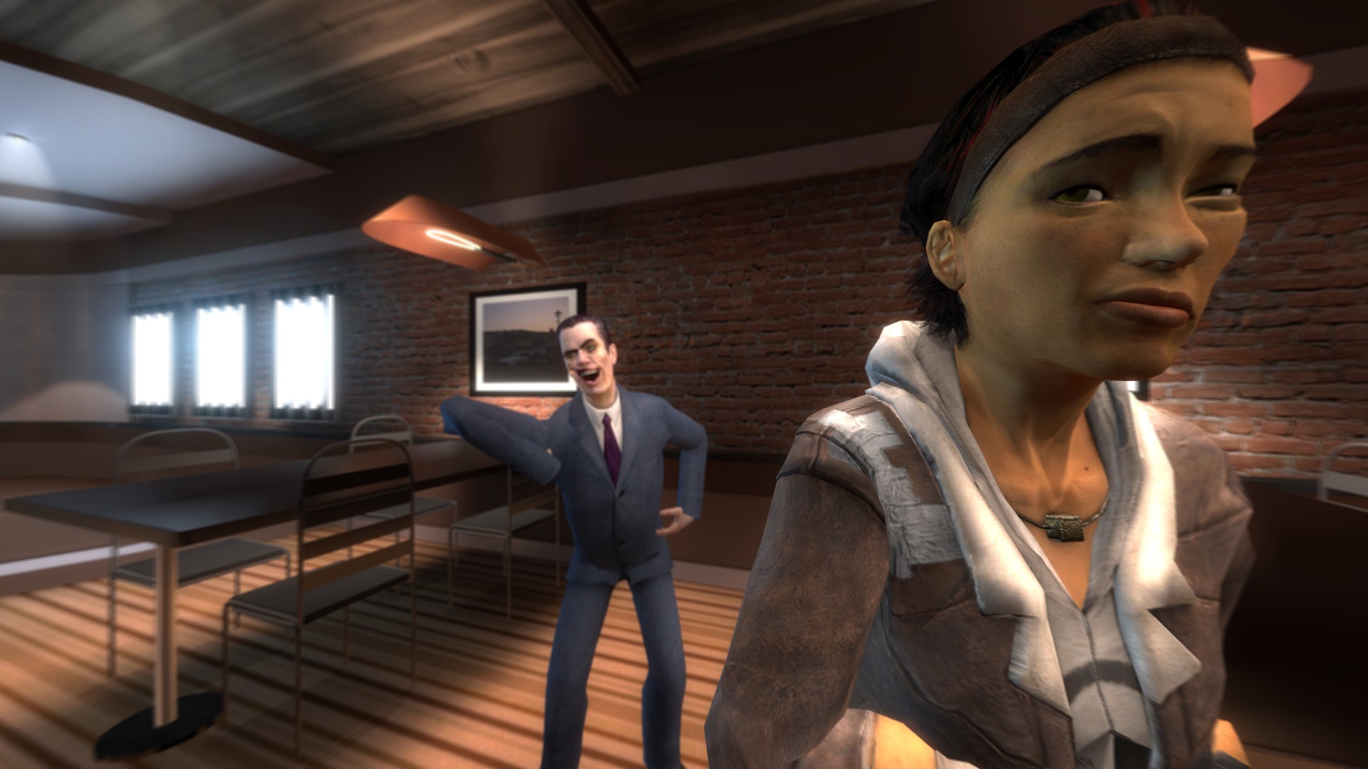
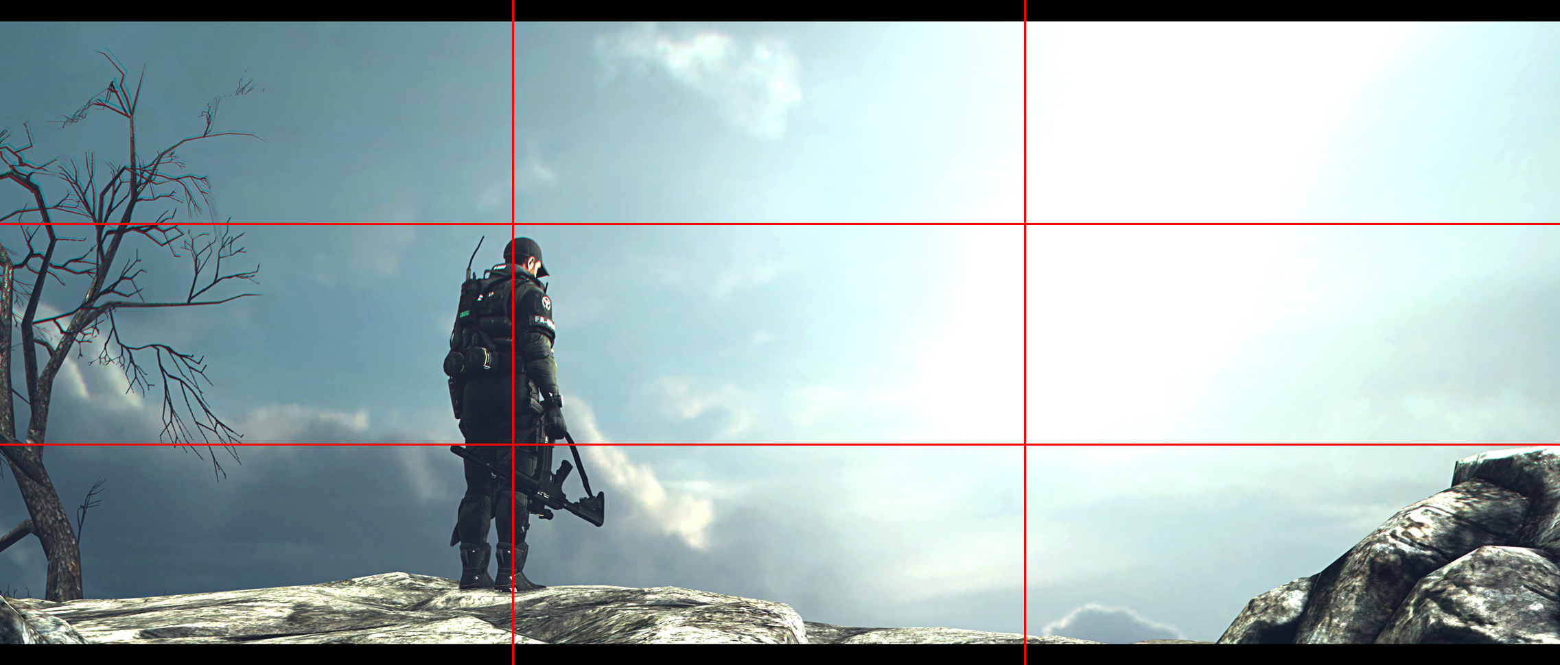
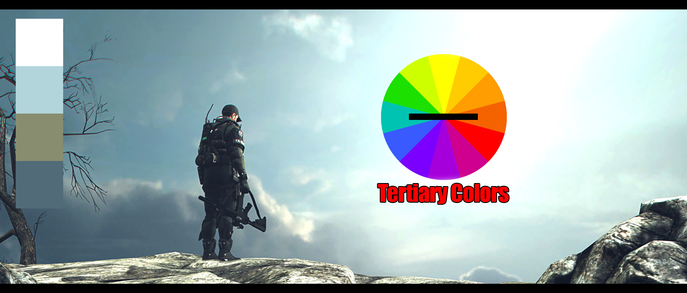
I'm wondering if I can get any feedback on it.
https://steamcommunity.com/sharedfiles/filedetails/?id=1468116630
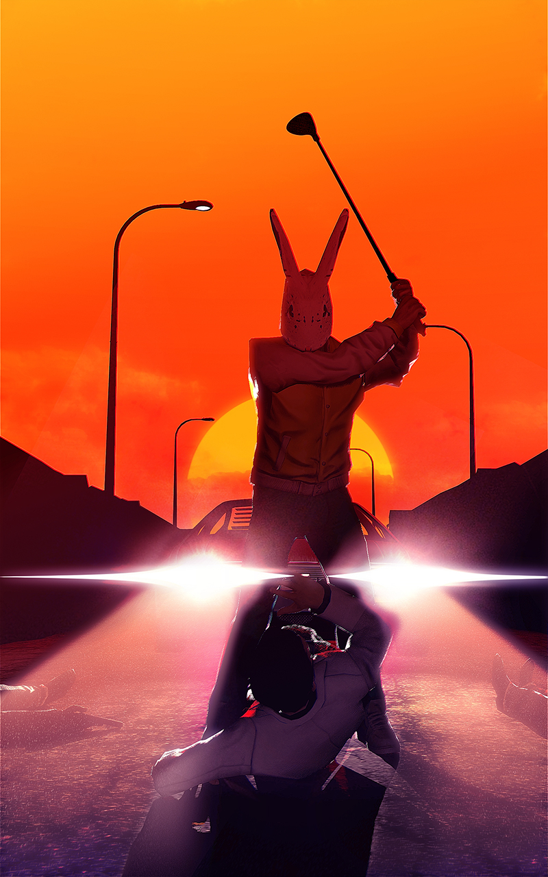
Don't mind the weirdness of it! Thanks again!