Warframe

Warframe

107 vurderinger
Paintjobs 101: Optimizing the Default Palette
Af Pantera Bread
Frustrated with the lack of color choices offered by default for your Warframe? Do you lack the funds to buy some Plat, or are you saving your precious Platinum for a purchase more practical than some useless old palettes? The default color palette "sucks," you say-- And while this is partially true in that the palette does greatly limit one's color choices, the palette can still be exploited, and when given the proper attention, can make any Frame, weapon, Sentinel, etc. look good. This guide is here teach you some useful tips, tricks, and loopholes for making due with limited color choice, as well as a few tips on general coloration.
   
Pris
Føj til foretrukne
Gjort til foretrukken
Fjern som foretrukken
Foreword
While it is true that the default color palette is very limited as far as choice of colors goes, the thing can still be exploited to make your gear look good; I am here to teach you how this can be done.

There are several things one can do to optimize the junky old heap of colors we know as the default palette. One asset I find particularly useful is a little beauty called the Legacy Palette. This leads us into our next section...
The Legacy Palette
The legacy palette is an aspect of the game that many players may not be aware of-- and this is understandable, as the palette is hidden deep within the settings menu.

The palette, though not a full solution to the color problem, can help alleviate your color woes. It features the same basic list of colors found in the default palette, but much less saturated, basically amounting to a second row of colors you can use in the default palette. They are far lighter than their default counterparts, and when used in conjunction with the default colors, can greatly increase the level of customization the default palette brings to the table.

Example:
Orange-red in the default palette:


The same color in the legacy palette:


Do you see how this could be useful? When used properly, the default and legacy palettes working together can have stunning results.

I would not, however, recommend using the legacy palette alone. That is, unless you're into that kind of thing...

Activating Legacy Color Palettes

Anyway, at this point you may be asking, "great, so how do I get to it?" Here is how, young Padawan:
  • Go to your menu (press escape).

  • In the GAMEPLAY tab, look through the list until you find the option titled "Legacy Color Palettes" (it should be the sixth one from the bottom).
  • Toggle it ON.*

  • That's all. Legacy colors should now be accessible.


*Please note that in order to use both the default and legacy palettes, the Legacy Color Palettes option will have to be toggled on/off.
Proper Use of Colors
Creating Contrast

Contrast is a very important element in creating successful coloration. In case you're unsure, here is a formal definition of contrast:
Contrast

noun
/ˈkänˌtrast/

  1. the state of being strikingly different from something else, typically something in juxtaposition or close association.
And thank yooou Google.

Knowing this, here is a pictoral example of contrast:
Contrast is something you should always keep in mind when creating a new color scheme, especially in relation to other gear you'll have equipped.

Complementing Colors

And no, I do not mean literally giving verbal compliments to colors. Not the same word.

Complementary colors are another important component of a good color scheme.
Complementary

adjective
/ˌkämpləˈment(ə)rē/
  1. combining in such a way as to enhance or emphasize the qualities of each other or another.
In terms of colors, complementary colors are those opposite each other on the color wheel-- Like when you're wearing clothes that "match"-- that is just another way of saying you are wearing complementary-colored clothing.
Some complementary colors on this color wheel would be red & green (but never use those unless you want to look like a full-blown Christmas elf), orange & blue, and purple & yellow.

Keep this in mind when choosing your main colors.
A Word on Color Schemes
When choosing a color scheme, you generally want to have a dark color, a lighter color, and another lighter color that compliments the first; all other colors should also compliment those two colors (I recommend using various shades of the same color, or a different color that is not more than one square away from the color or colors).

Warframes usually have a dark color by default, normlly applied to the areas not covered by armor plating. Usually it will be labeled as the secondary color. For example, Rhino's secondary color is a dark bluish-gray which covers most of his abdomen, neck, and other miscellaneous areas. This, in my opinion, is the best placing for your dark color. If your primary color is also dark, make sure your "dark" color is darker.

Weapons, Sentinels, and Energy

Another thing-- NEVER, under any circumstances, should your energy color be the same as another color you're using. It should always be a bright color that creates contrast and compliments the other colors in the scheme. Legacy colors generally work well for this as they are much lighter and therefore create a brighter glow. And while you may think it's cute to have your weapons or sentinel match the colors of your Frame, trust me, in most cases, it's not. You always want to choose a different color scheme for these, one that contrasts with the colors of your Frame (but arguably still compliments).

An example of this is the color scheme I have chosen for my Vectis:

See contrasts nicely with the colors of my Rhino, yet still has a dark and two lights, and an energy color that contrasts?

Weapon and Sentinel Energy

The energy color you choose for your weapons/sentinels can be the same color as the energy color of your Frame, but it doesn't have to. It truly doesn't matter what color that their energies are, so long as it meets the aforementioned criteria. Really, the color you choose depends on what looks best with the individual color scheme of that item.
Conclusion
Now that you've been equipped with this knowledge, be free! Go and spread sexy looking Warframes throughout the solar system for all to see!

(And if you found this guide useful, please let me know.)
33 kommentarer
MrDubbyWubby 3. nov. 2015 kl. 14:09 
Thank you so much :D
Kono DIOna 12. dec. 2014 kl. 22:05 
"Did you just tell people NOT to match their weapons' colors to that of their warframes?
HERESY!"

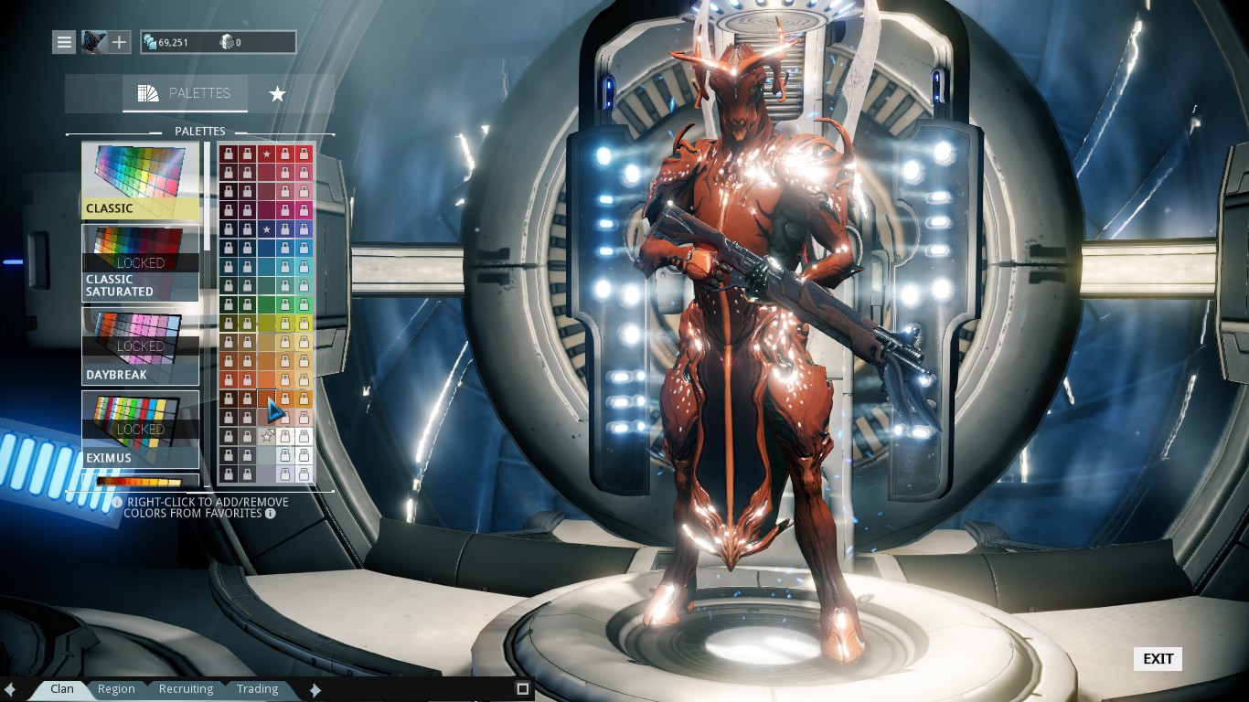
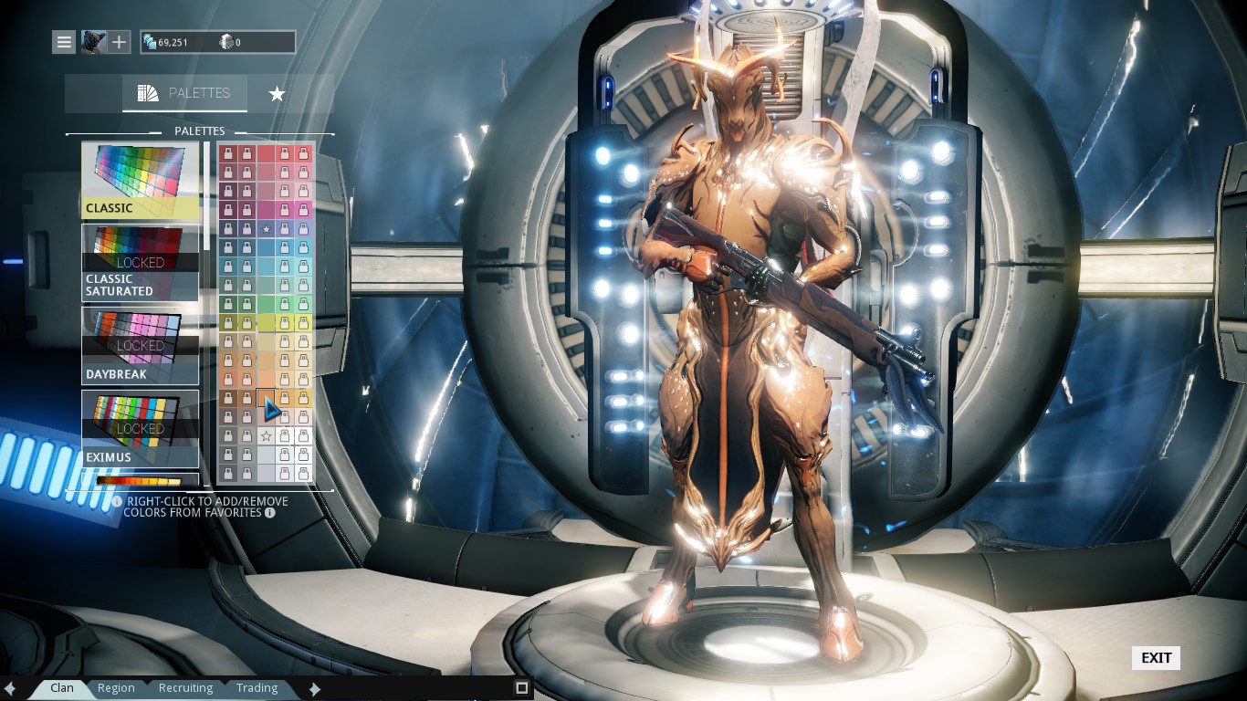
well unless you're making a thematic loadout(eg: Frost equipped with Glaxion or Ember with SilvAegis), the weapon isn't frame exclusive item. Sure it's cool to have your Quanta matching with your Volt, but you'll changing color a lot if you're using it with other frame.

I only matching my Archwing color and Warframe color. I colored my Odonata with white-black-yellow and the only pilot is Volt, so on color C, I match my Volt to white-black-yellow.
Pattern Recognizer 2. nov. 2014 kl. 19:56 
After then everyone colored their frames in black and acid green. The End.
Dr.Volga 27. okt. 2014 kl. 12:32 
legacy colour part is fun.
chief 25. okt. 2014 kl. 19:32 
I liked this guide.
twystd 25. okt. 2014 kl. 9:00 
i guess it'd be nice to note that there are occasional color pallettes which are free (or cost 1 credit in some cases) during events ie. halloween (atleast they were last yr)
Laexis Karrakir 24. okt. 2014 kl. 9:35 
Did you just tell people NOT to match their weapons' colors to that of their warframes?
HERESY!
Kono DIOna 22. okt. 2014 kl. 6:18 
Another one. Flesh-and-bone colored Nekros.

http://steamcommunity.com/id/koesir/screenshot/39730888959696110
Phocron the Memehunter 21. okt. 2014 kl. 20:16 
Its extraordinairely rare to see someone with such simplified way of explaining instinctive concepts to those less aware, this guide is by and far the simplest and most effective guide to basic coloring Ive had the pleasure of reading in a long time
A salute to you
Splishy Boi 21. okt. 2014 kl. 18:34 
thanks really helped