

LIBERATED

LIBERATED

View Stats:
Brightness Calibration isn't right.
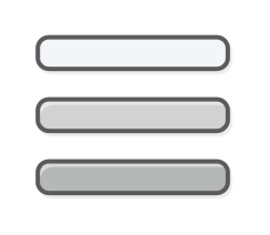
The in game calibration never gets to "barely visible" with any of the displayed icons, but it does make the comics extremely difficult to see when setting the brightness to the lowest setting.

Or to explain more fully, the furthers left icon should have been representing near black colors and the middle colors that are just distinguished enough to strongly make out. So the current system causes overturning since they're all too bright to tune with.
< >
Showing 1-3 of 3 comments
Jul 30, 2020 @ 11:26pm 
Originally posted by Mouse:
The in game calibration never gets to "barely visible" with any of the displayed icons, but it does make the comics extremely difficult to see when setting the brightness to the lowest setting.

Or to explain more fully, the furthers left icon should have been representing near black colors and the middle colors that are just distinguished enough to strongly make out. So the current system causes overturning since they're all too bright to tune with.

Hi Mouse - thank you for your feedback.

We've tested the game with multiple screens, the internal ones on the notebooks, and external monitors from multiple companies. Getting the right contrast to brightness ratio is really important to us, as our game heavily operates on the shadows, and getting the right proportions between whats visible and what's hidden in the darkness was always our goal.

We've tried to tweak this calibration screen to represent the brightness controls as close as possible on as many screens as we could, but there's always some scenarios that we did not predict.

Could you tell us what monitor are you using? Is it an IPS, TFT, VA, or OLED panel? What maximum brightness does it have? Is it in some specific mode - like reading mode, power efficiency mode, etc.?

It usually is the best option to just leave the brightness control on the middle default and tweak it according to your needs.
Originally posted by Adderam:
Originally posted by Mouse:
The in game calibration never gets to "barely visible" with any of the displayed icons, but it does make the comics extremely difficult to see when setting the brightness to the lowest setting.

Or to explain more fully, the furthers left icon should have been representing near black colors and the middle colors that are just distinguished enough to strongly make out. So the current system causes overturning since they're all too bright to tune with.

Hi Mouse - thank you for your feedback.

We've tested the game with multiple screens, the internal ones on the notebooks, and external monitors from multiple companies. Getting the right contrast to brightness ratio is really important to us, as our game heavily operates on the shadows, and getting the right proportions between whats visible and what's hidden in the darkness was always our goal.

We've tried to tweak this calibration screen to represent the brightness controls as close as possible on as many screens as we could, but there's always some scenarios that we did not predict.

Could you tell us what monitor are you using? Is it an IPS, TFT, VA, or OLED panel? What maximum brightness does it have? Is it in some specific mode - like reading mode, power efficiency mode, etc.?

It usually is the best option to just leave the brightness control on the middle default and tweak it according to your needs.

OLED Samsung SDCA029, My issue was that when in default settings, the calibration screen appeared brighter than I would have expected it to be, but default seems to be the best setting when actually playing the game.
Aug 12, 2020 @ 5:20am 
Oh, it's an OLED - we haven't tested the game on such screens yet :/
Thank you for the feedback - it will help us to do some improvements if possible.
< >
Showing 1-3 of 3 comments
Per page: 1530 50